Author: DelvinTekon

  • SECTION 3 QUESTION 2

    1. Based on the topics discussed in class as they relate to social media content and planning, please create two (2) Facebook posts for your revised Audience “A”. For each post, please outline your planning criteria and justify your goal, reasoning, and key elements. Don’t forget to include the destination for each post and your reasoning and goals for each. (10 X 2 = 20 marks) 

    a. Create a post promoting the product. 

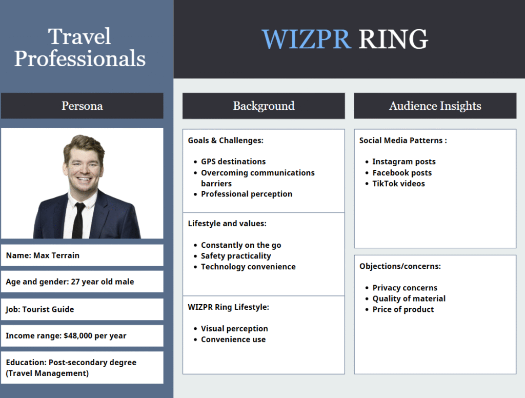
    Facebook Post #1 – Product Promotion – Audience A: Travel Professionals

    Destination: WIZPR – Product Landing Page

    The reasonings and goals behind this facebook post was to target travel professionals and introduce the product WIZPR to them while solving a pain point for them. This audience is known for being a part of the late majority, meaning they require a lot of convincing before purchasing. The goal of this post is to provide a sense of emotional connection in a way of including a pain point, relating to their profession in the travel industry. The CTA would take them to the product landing page, which showcases the features of the product and all necessary information required to convince them to purchase.

    Travel professionals must stay communicated at all times with their team or group of travelers, depending on the job type in the travel industry. The main pain point is that they are constantly on the go while carrying luggages, documents, devices, etc. The headline stating “On the go, but never out of touch”, refers back to the values of this audience, which includes safety and convenience. Targeting the convenience of communicating hands-free without being at risk with their personal items with them.

    Key elements include:

    • Visuals: Travel agent on an urban transit, speaking directly to the WIZPR AI Ring.
    • Typography: The headline is in white, near the bottom of the page with the CTA being placed above it, creating the contrast for readability effect while being accessible on mobile devices.
    • WIZPR: On the top left of the post, “WIZPR” is displayed utilizing blue and white from their website scheme. The sub-heading “AI Ring” provides the reader a slight clarification of what the product will provide and how it will benefit.
    • CTA: The call-to-action acts as a trigger for those interested in reading more about the product.

    b. Create an engaging post that drives awareness and action (e.g., participation, sharing, excitement for the product, signing up for the waitlist).

    Facebook Post #2 – Beta Waitlist – Audience A: Travel Professionals

    Destination: WIZPR – Landing Page (Email)

    The reasonings and goals behind this facebook post was to promote our beta waitlist for travel professionals who are interested in representing the WIZPR Ring. As stated previously, this audience falls under late majority and by giving them the opportunity to beta test our product, it can increase purchase behavior because they have had the chance to try it out to their liking. This post promotes conversion over promotion from the first Facebook post. Inviting our audience to have the chance to try out the product, shifts them from being a passive viewer to an active viewer by engaging with WIZPR.

    The headline “Wear the future of AI”, is to appeal to the audience for convenience in their job. Along with the call-to-action being “Join the exclusive beta list”, creating the sense of FOMO and urgency to sign up as only 30 spots are available. This actually creates the late majority’s to make a decision quicker because of the exclusive opportunity to try it out in-person before it is released – allowing them to grasp a better idea on if this product is right for them or not.

    Key elements include:

    • Visuals: Travel agent on the go, speaking directly to the WIZPR AI Ring.
    • Typography: The headline is in white, on the left side of the page for better scannability and following the basic structure of the F-pattern, with the CTA being placed below it. This creates the contrast for readability effect while being accessible on mobile devices.
    • WIZPR: On the top left of the post, “WIZPR” is displayed utilizing blue and white from their website scheme. The sub-heading “AI Ring” provides the reader a slight clarification of what the product will provide and how it will benefit.

    CTA: The call-to-action acts as a trigger for FOMO and urgency to claim their spot for the beta testing.

  • SECTION 3 QUESTION 1

    1. Based on your research, what social media platforms do you think they should target as it relates to your defined audiences (2), content and getting our message across for our specific campaign? Please justify your answer. (2 X 5 marks) 

    Before choosing which social media platforms suit best for our audiences, we need to position the WIZPR AI ring to align with the strengths of the platform and the audience selected. The focus is that WIZPR has no identity published, meaning we need to establish the presence through the authority of social media platforms, showcasing what this product’s features are and which pain points this solves for each audience.

    Social Media Platform: Instagram

    Primary Audience: (Travel Professionals)

    We believe that WIZPR should target Instagram as their preferred social media platform for our primary audience.

    The reasoning behind the choice of this social media platform is that Instagram was originally created to post pictures, turning into portfolios for users to view. For travel professionals, this is a great way to take advantage of the portfolio designed platform. They value cultural exploration, safety, and reliability. The segment being (ages 24-38 years old), view Instagram as a place for discovery in destinations and lifestyles from various creators. 

    WIZPR’s AI Ring has yet to be discovered worldwide, which is why we believe Instagram reels are the key to our showcase and discoverability. We are aware that travel professionals are constantly relying on the use of communication and navigation barriers. Through reels, we can showcase WIZPR’s discoverability features such as GPS, and AI translations being used in action at a certain destination, to help solve pain points for our audience.

    Referring back to Instagram being used as a portfolio platform, travel professionals would prefer that the WIZPR AI ring is aesthetically stylish while being performative, when posting on social media. A popular tech gadget such as the Apple Watch, visually looks bulky and more tech savvy, rather than stylish like a standard ring. In this case, the WIZPER AI ring is both stylish and performs at a high level like an Apple Watch gadget. 

    Utilizing travel-related hashtags and partnering with travel-creators for sponsorships, this can increase the visibility of the WIZPR product to fall on Instagram feeds from our selected audience and their similar pain points such as convenience when traveling.

    Social Media Platform: Facebook

    Secondary Audience: (Value-based consumers)

    We believe that WIZPR should target Facebook as their preferred social media platform for our secondary audience.

    Value-based consumers are a non-tech savvy, brand-loyal, and family-orientated audience with their segment being (ages 32-55 years old). Facebook will provide the benefit of purchasing the product, earning the trust from the audience as they only care about the end results and how this product will help them with their kids, save time, etc. Facebook’s audiences are used primarily for family-based values through groups, where different families help each other out with tips and tricks for workability.

    This audience falls under the late majority of buyers as they don’t purchase products because it looks cool but rather they are recommended through Facebook groups targeted towards a community of those with a family. As we know, WIZPR has no presence in the technology industry, so we can change that by posting in “family community” or “parenting” groups on Facebook. Posts that come from these communities come from individuals promoting the benefit of the product and not the technical specifications, which aligns perfectly for this audience.

  • SECTION 2 Part B Question 3

    3. Develop the content for the “landing page”. Based on the differences outlined in Part “A”, question #2, address how the content including the various web content elements will be different. Identify what you have done different and provide in-depth reasoning for your approach, goals, the content and the desired results. You will provide the content for the landing page in the same format as the website. (10 marks) 

    The Wizpr Ring landing page is created to serve one singular objective that is backed by every section, every headline, and every piece of copy on the page and that is to convert a consumer who has arrived through a targeted email campaign or paid advertisement into a VIP pre-order at $99. This page was sent to existing subscribers which means the visitor already has made some sort of commitment with the brand. They have expressed prior interest by subscribing. This page is made to convert them from interest to action that is a financial commitment before a countdown timer reaches zero. 

    Section 1: Hero section, “you’ve been selected for VIP early access.”

    A website’s hero section exists to introduce the company and product to any and every possible audience group at the same time. The landing page hero operates on an entirely different reason and it is clearly understood in every world of the headline compared to traditional website hero sections that are broad to the mass differentiated audience groups. “You’ve been selected for VIP early access” is written to create a feeling of exclusivity to the user that persuades them to keep on reading the content below. The visitor is being told that they specifically have been chosen for something that is not available to everyone which is aligned with this landing page because the visitor arrived through an email campaign sent to existing subscribers meaning that the statement is factually correct since it arrived in their inbox and not on their social media feed for everyone else to see. This offer is only available through this specific page to this specific group of people. A website cannot replicate the same type of headline that connects with the visitor more emotionally because the website is being looked at by anyone who searches the brand name or follows a link from a article. Placing “you’ve been selected for VIP early access” on a website homepage would immediately contradict itself when a non subscriber arrived and read it which hurts their credibility of the exclusivity claim because they can now be seen as an untrustworthy brand due to their false promise of it being accessible to everyone at any given time. The countdown timer is a element in this section that reflects strategic difference 1 from Part A question 2 because a website is built on its long term viewability in having a business online that anyone can engage with anywhere and anytime as opposed to a countdown timer does the complete opposite. This element puts fear and urgency into the subscriber to make a decision on whether or not they want this limited time offer that only they have received which drives them into the conversion decision because this offer won’t be available after the time expires. Without the timer, a consumer who feels interested but not yet certain enough to act right away can close the tab and come back later which can result in them never returning. The timer counting down in front of them, the cost of leaving is $40 and is visible in real time. The landing page has no navigation or separate pages for the visitor to find which means that every piece of information that is in the landing page is specific to whoever was able to open it because they are one step closer in taking action than random visitors scrolling through the website since they signed up for their email list that shows much more commitment than that random visitor. 

    Section 2: “your VIP package includes”

    A website product features page is created to serve the multiple audience groups that involves having different types of content made to communicate the same message to different audience groups with different needs. The landing page features section only has elements that resolves the specific objections a consumer carries during the decision making process and that being spending $99 on a pre-launch AI ring. Every feature is chosen and worded specifically because it removes a barrier to the $99 commitment. The VIP exclusive perks answers the common question on the page, why should I order at $99 right now instead of waiting until this product appears in stores at $139? This question is much more relevant on a landing page because the consumer on this page has already expressed interest by subscribing, meaning that the barrier that is preventing them to commit is financially. The VIP exclusive perks addresses that barrier with five specific answers.

  • SECTION 2 Part B question 2

    2. Provide the content for each page. Ensure that each page includes the various content elements and structure as discussed in class. For each page, provide in-depth reasoning for your approach, goals, the content and the desired results. Make sure you address the concepts we discussed in class. (20 marks)

    Home page:

    The purpose of the home page is to show off the ring and tell visitors why they should purchase it. This page serves the purpose of setting the tone for the rest of the website as well as the brand and product. It’s the first point of contact for customers. The page intends to encourage visitors to buy the product by giving them reasons as to why they should. The call to action is clear and straightforward, prompting visitors to pre-order the ring on Indiegogo.

    Product page:

    The purpose of the product page is to go in-depth about the product. This page gives visitors insight into what that page is exactly, discussing hardware, features, and specifications.  The page also features a call to action, prompting visitors to act and buy the ring. This page was designed to be info-driven and give visitors the information they want and/or need in order to transition into paying customers.

    Story page:

    The story page is a quick summary of the company’s history up until now. The appeal of the story page is to have visitors resonate with the story of the company. The call to action on this page is clear, the appeal of the page makes visitors connect with the brand by understanding the story and wanting them to be a part of our journey by purchasing the WIZPR ring.

    FAQ page:

    The FAQ page is simple; the questions on the page are all curated by the brand to clear up confusion about the product as quickly as possible. The questions incorporate keywords that relate to the ring and its features, such as WIZPR, the name of the ring, obviously, AI assistance, SOS mode, etc. The content for this page is more copy-heavy than image-heavy for the purpose of being clear and not distracting the visitor from their primary objective, answering their questions.

    Contact page:

    The contact page provides the company’s details for communication, primarily the email. The page allows users to submit their email and inquire further about questions, comments, or concerns they might have. This page serves as the point of communication between the company and customers. 

    Blog page:

    Lastly, the blog page provides visitors of the page with much more information about the WIZPR ring. This page allows visitors to further their knowledge of the ring by reading articles made by the company, and external articles made by other businesses or people, externally linked to the page.

  • SECTION 2 Part B Question 1

    Website – Part B (Execution)

    As mentioned above, you are tasked with creating a general website to focus on organic website visitors. You will be responsible for the website content structure including the content. The site will be a minimum of five (5) pages not including the home page. You will not be required to create a “working and live” website, rather a mockup website in a paper format. 

    Here is what you will need to provide: 

    a) A sitemap illustrating the various site pages. 

    b) A complete page for each page of the website inclusive of the website content. 

    c) A homepage mockup including the main site navigation.

    Tasks: 

    1. Provide a general overview of the website including the page titles as well as a brief overview & intent for each page. Based on your research and knowledge covered in ADV 421 (as well as included in this project), provide in depth reasoning as to why you structured the site in this manner and why you intend to create the specific content. (10 marks) 

    The WIZPR AI Ring Website is a 5-page site (6 if the home page is included) designed to give customers a space to explore the product. The website features pages such as Product, About, FAQs, Blog, and Contact. Each page title has been named with SEO intent. Each page title features the name of the business, WIZPR AI Rings, for search intent. When searched, customers will understand exactly the information each page offers. The keywords in the name of each page help boost search results, letting Google know what they’re indexing when providing search results based on users’ searches. The content on each page will accurately reflect what the page is for, as well as provide the visitor with the information they are looking for. 

    Product page – (WIZPR AI Rings):

    This page is the product page. The purpose of this page is to display the product for visitors to assess and make a decision to purchase. The page displays the product’s features and informs visitors of the benefits and value it provides. This page is made with the intent to convince visitors to purchase, and the content created for this page will reflect that. The goal is to push customers further down the funnel and convert them into paying customers.

    About page – (WIZPR AI Rings Story):

    The About page serves the purpose of being the trust builder of the website. This page intends to speak directly to customers and inform them of the business’s mission and goals. The About page acts as a means to build credibility. This is meant to give consumers a reason as to why they should trust the brand. The about page humanizes the brand in the eyes of visitors. This is especially important for a brand that utilizes AI technology, since people are already very skeptical about it. The about page is meant to give customers more assurance of the brand and product.

    FAQs page – (WIZPR AI Rings FAQs):

    The FAQs page is meant to tie up any loose ends about the brand and product. The page acts as a hub for questions and concerns, curated by the company, that potential customers might have while buying the ring or before buying the ring. The point of this page is to make customers transition down the purchase funnel, by clearing up any confusion or misconceptions about the product or brand right as they occur. We can encourage customers to reach the decision of purchasing quicker. The FAQs page is also beneficial for SEO purposes. By using relevant keywords, the FAQs page is more likely to get indexed based on customer search Queries. 

    Blog page – (WIZPR AI Rings Blog); 

    The purpose of the blog page is to keep people up to date on any news regarding the brand or product. The page serves as another trust builder for potential customers. The blog page will be filled with informative content that provokes engagement from customers. The blog page will feature both articles curated by the company as well as external articles to increase the options for customers who are curious about the brand or product. The blog page acts as a hub for user engagement, and customers can share their thoughts and opinions about the brand or product, as well as their experiences with the product or brand.

    The blog and the FAQs page are similar; however, they differ in purpose. The FAQs page is questions, predominantly curated by the company, meant to prevent confusion or misconception as customers become more interested in the product, while the blog page is for consumers to relay information among themselves and for additional, external information about the product to build trust with our audience. 

    Contact page – WIZPR AI Rings Contact

    The contact page is where customers can personally inquire about the product. The company’s contact information: phone number, email, mailing address, etc., is listed for those who have deeper questions, comments, and concerns about the company or the product. It’s a communication tool and helps build trust with the audience.

    2. Provide the content for each page. Ensure that each page includes the various content elements and structure as discussed in class. For each page, provide in-depth reasoning for your approach, goals, the content and the desired results. Make sure you address the concepts we discussed in class. (20 marks)

    Home page:

    The purpose of the home page is to show off the ring and tell visitors why they should purchase it. This page serves the purpose of setting the tone for the rest of the website as well as the brand and product. It’s the first point of contact for customers. The page intends to encourage visitors to buy the product by giving them reasons as to why they should. The call to action is clear and straightforward, prompting visitors to pre-order the ring on Indiegogo.

    Product page:

    The purpose of the product page is to go in-depth about the product. This page gives visitors insight into what that page is exactly, discussing hardware, features, and specifications.  The page also features a call to action, prompting visitors to act and buy the ring. This page was designed to be info-driven and give visitors the information they want and/or need in order to transition into paying customers.

    Story page:

    The story page is a quick summary of the company’s history up until now. The appeal of the story page is to have visitors resonate with the story of the company. The call to action on this page is clear, the appeal of the page makes visitors connect with the brand by understanding the story and wanting them to be a part of our journey by purchasing the WIZPR ring.

    FAQ page:

    The FAQ page is simple; the questions on the page are all curated by the brand to clear up confusion about the product as quickly as possible. The questions incorporate keywords that relate to the ring and its features, such as WIZPR, the name of the ring, obviously, AI assistance, SOS mode, etc. The content for this page is more copy-heavy than image-heavy for the purpose of being clear and not distracting the visitor from their primary objective, answering their questions.

    Contact page:

    The contact page provides the company’s details for communication, primarily the email. The page allows users to submit their email and inquire further about questions, comments, or concerns they might have. This page serves as the point of communication between the company and customers. 

    Blog page:

    Lastly, the blog page provides visitors of the page with much more information about the WIZPR ring. This page allows visitors to further their knowledge of the ring by reading articles made by the company, and external articles made by other businesses or people, externally linked to the page.

  • SECTION 2 Question 2

    2. Provide four (4) strategic structural differences and justify them deeply. (12 marks) 

    Strategic difference 1: A single conversion goal versus brand awareness towards multiple audiences

    The strategic difference between a landing page and a brand website is the structural logic each one is built on based on the purposes they serve because they are solving entirely different problems at the same point in the pre-launch process. 

    A landing page is built around a singular conversion goal. Every web design element on a landing page such as the design and copywriting is based from one question, which is, what does this specific visitor need to see in order to complete this one specific action? In a pre-launch phase, that action is almost always an email submission through a waitlist signup or an early access registration. It is the main focus around the landing page as a whole since all the content in it is created to make the user perform the desired action. The headline is immediately communicating the value proposition that determines in the first few seconds of the user landing on the page whether or not they should read what the page is about. The product image is selected to create desire in the mind of the consumer with a mental image that pictures themselves using the product before they actually buy it. This allows the user to connect with the product based on the experiences in their own lives where they would actually see themselves using it and deciding if it is worth buying. The benefit statements are written to address the most common objections that consumers are worried about before they commit with giving up their contact information because it gives them answers to their problems with having to go to another competitors website and finding the solution elsewhere. The call to action button is worded to make the commitment feel immediately rewarding, that they made the right choice. There is no navigation menu. There are no links to other pages. None of these elements exist on the landing page because none of them serve the single conversion goal the page was built to achieve. Every additional element added to the landing page that does not directly support the conversion action for the desired user is a distraction that reduces the chances of them taking that action because there is no information that delivers a different message for a different purpose that doesn’t align with the contents of the landing page. 

    A brand website is built on an entirely different structure. The website is built to serve different audience groups that each arrive at your website with completely different questions, different levels of knowledge about your product, and different needs that require certain evidence they need to see before they take any further action. Some of these different audience groups are consumers, journalists, investors, and retail buyers. A consumer arrives asking whether your product solves a problem they have and if your company is trustworthy enough for them to spend their money on. A journalists arrives asking what your product’s technical specifications are. An investor arrives asking you who is founding your team. A retail buyer from a company such as Best Buy arrives asking whether your brand has the consumer demand to justify shelf space. Your brand website has to provide useful content that answers all four of those different questions at the same time because you cannot predict which audience group is going to arrive at any given moment. Each of these audience groups matters in the pre – launch phase because they each play a role in the success of how well the product will do before it even gets released to the public to purchase. This is why the brand website requires open navigation with dedicated sections for each audience. A homepage introduces the brand to every audience group. A product page serves consumers. A blog page serves journalists. An about page serves investors. A contact page serves retail buyers. Each page exists because each audience group has different needs that need to be met. 

    Strategic difference 2: product demand evidence versus long-term brand credibility

    A landing page produces immediate demand evidence because in order to land on the page in the first place comes from a link that is not a part of the website through either an advertisement of some sort or an email. When a consumer submits their email address to join your waitlist, they are already taking action that carries a real cost toward the brand. It costs their privacy, their contact information, and the silent acknowledgment that they are interested enough in you product to want to hear updates from you regarding when it launches. A person who visits your brand website and browses your product page for three minutes has not committed to anything. A person who submits their email address to your landing page has made a small but big commitment that reflects guinea purchase intent because they are interested in receiving news and updates regarding the brand and product. If they have zero intent in making a purchase they would have never signed up in the first place because emails are getting sent to their inbox that they do not want to see. The difference between these two types of data is the difference between telling a retail buyer that your product has generated strong online interest and showing them that 40,000 people have actively expressed their intent to purchase before the product is even available. A buyer from Best Buy is accountable for the sales performance of every product they decide to place on their shelves. If a product they stock fails to achieve the targeted number of sales to justify its shelf space it takes up, Best Buy will lose out on a lot of money. Retail buyers are skeptical when they are approached by a business with no sales history or data to show that their product is a need. A waitlist of 40,000 email subscribers immediately gets rid of that scepticism because it is behavioral data rather than projected data. It reflects actions that real people took under no pressure that would’ve taken place in the stores when employees are trying to convince them to buy it. The retail buyer can look at the data and figure out what a percentage of those people converting to in-store purchases would mean for their targeted sales goal in a certain amount of time. They can see that your marketing message was persuasive enough to motivate 40,000 voluntary actions before the product shipped, before they could purchase it, and learn more. A landing page with a large email waitlist tells the retail buyer that your product has a large enough audience that needs this product. 

    A brand website produces a long-term brand credibility that is a trust signal to the user that applies to each different audience group. Unlike the demand evidence data within landing pages, the websites brand credibility is based on every interaction and engagement formed over time by any visitor on the website. Having credibility within a brand’s website also mainly revolved around the design and contents of what is actually in the website with regards to how well it is optimized for SEO that appeals to Google’s algorithm. This credibility is immediately recognized by the user when they search for your product in the inquiry and see whether or not your website appears toward the top of the rankings or not at all. Google only shows websites on the first page ranked high that they believe is the most accurate and relevant to what the user is searching for. It comes down to how helpful/useful your content is, having one h1 tag per page, alt tags on images, reducing the image sizes, backlinks, and countless other factors that plays a role in having a credible website. You need your brand website to generate the credibility that makes your landing page believable. A consumer who sees your product advertised, feels interested, and then searches your brand name needs to find your website that confirms to them your legitimacy. Without that confirmation a percentage of those consumers will not submit their email address because they cannot verify that your company is real. 

    Strategic difference 3: paid traffic efficiency and return on ad spend 

    A landing page is the destination for paid advertising traffic during a product pre-launch campaign. Every visitor who arrives at your landing page through a paid advertisement has their full attention toward a single decision which is submitting their email address or leaving. The time between this decision is what produces the conversion rates that make paid traffic to landing pages financially worth it. Lets say you spend $5,000 on a paid meta campaign that generated 10,000 visits to your landing page at a 5% conversion rate, you leave that campaign with 500 email addresses from people who have actively expressed interest in your product. Your cost per lead is $10. That list becomes an asset. You can now use it to send out specific emails such as launch day emails because they signed up to eventually purchase your product. You can use it to build a pre-order campaign. As well as a retargeting audience for your next paid campaign. You present the size of that list to retail buyers as evidence that your paid traffic generated you a list of people that will give you a better return on your investment. Sending that same $5,000 worth of paid traffic to your brand website homepage produces a far less efficient outcome. A brand website has navigation menus with multiple destination links, a hero section, a product section, an about section, a blog section, a contact link, and a about us section that gives the visitor multiple interactive forms of content that is competing for their attention as opposed to being devoted to one thing that has a specific message, for a specific group of people, at a specific time. A homepage is designed for exploration, not conversion. Visitors browse, read, watch, and navigate to whatever grabs their attention without being directed toward any specific action. This results in a large percentage of paid visitors to engage with your content without actually completing any action that can be measured because there isn’t a specific call to action that they should be clicking on since there is no specific message that is telling them to do that. The brand website is the correct destination for organic search traffic and for people who have encountered your brand through social media channels or other sources and want to learn more before committing because they need reassurance it is a trusted and credible brand. A consumer who sees your product mentioned in an article and searches your brand name to investigate further is arriving at your brand website with different motives and information need than a consumer who saw your instagram advertisement for the first time. The first consumer wants context and verification. The second consumer needs a conversion path. Sending both of these consumers to the same destination hinders the experience for both of them because they each have different needs. The consumer coming from the paid traffic wants to see exactly what it was that was in that specific advertisement that made them click in the first place because the ad is being promoted for one reason: to convert people to buy the product. The consumer coming from the organic traffic wants to learn more about the brand because they saw their content for a reason and that being based on their digital presence online regarding the content that view and search history.    

    Strategic difference 4: speed of deployment and strategic timing in the pre-launch phase 

    A landing page can be designed, written, and published in two to five days with the right tools. The landing pages would consist of: one headline, one subheadline, three to five benefit statements, and one call to action. The design would have: one hero product image, one email capture, and one button. The technical aspects would have: a working domain and using an ESP like Mailchimp to track data that can be used for future campaigns. The entire landing page can be live and collecting email addresses within a week of the product concept being finalised. This speed of deployment matters in the pre-launch phase because the moment you begin collecting email addresses for waitlist signups is the moment the demand evidence starts to build because you have a list of people who have showed interested in buying your product when it releases and these numbers will support your implementation shelf space when dealing with a retail buyer. Every week that your landing page is not live for people to engage with is a week of potential waitlist growth you are losing out on that can make the difference from being put on the shelf or not. If the pre-launch phase is twelve weeks long and you spend six of those weeks waiting for your full brand website to be built before you send out any conversion mechanism, you have already cut your demand period in half which means your waitlist will be half the size it could have been when you try talk with a retail buyer. For all of this to be the most effective you would deploy your landing page immediately within days of your product announcement going public and to already have your website built weeks before it gets sent out to build that trust and credibility with the user which increases the landing pages conversion rate and opens. A brand website requires a timeline of six to twelve weeks for it to be properly built and continuous updates on it to be properly recognized in the algorithm. The company is going to have to hire a copywriter that deals with all the content in the website, a designer to make it visually appealing on every page, and a developer that knows how to properly optimize it for SEO. Each of these workstreams takes time because each depends on one another.

  • SECTION 2 Question 1

    Website – Part A (Theory & Structure)

    1. Explain the difference between a brand website and a landing page in a pre-retail tech launch. (8 marks)

    A brand website and a landing page are two different tools that serve two different strategic purposes when it comes down to certain objectives. Understanding the specific role each one plays, and why those roles do not interlink with one another is important in creating an effective campaign that aligns with the brands objectives. 

    A brand website is a permanent, multi-page tool that communicates your company’s brand identity to multiple different users that belong in different audience groups at the same time. A brand website is not built for a single campaign. It is built to exist as a long-term online home for your brand on the internet for users to access at any time on the web. For example, when Apple’s Vision Pro shipped to retail, Apple’s website was dedicated to pages that went over the product’s design, technical specifications, the company’s history, and detailed press resources. None of that content was designed to force a single action. It was designed to serve all the different audiences who clicked on these pages with different questions and different levels of knowledge about the Apple Vision Pros. Every brand website has an open navigation that lets these audiences choose their own path through their content based on what each of their needs are. A journalist clicks toward the press page. An investor reads your about section. A consumer watches a product video. A retailer looks at your distribution and contact information. Every one of these actions matters for a pre-launch campaign because each page is providing information for all these different audiences that creates awareness about the Vision Pros before a single unit reaches a shelf and is released to the public. A brand website also establishes to the user it’s legitimacy and authority within Googles search engines based on where they appear in the rankings. If the brands website is one of first results that appears than most users will gravitate towards clicking that website because it signals trust based on how the design/layout of their website, the helpful/relevant content on the page, and many on/off page factors that Google takes into account for a brand to be visible to the user. If Google trusts the website then the user can too which is why they have them ranked high in the search inquiry since their website aligns with the users needs in what they are searching. This is why having a website established in the pre- launch campaign phase is important because since the product does not yet exist in stores and consumers cannot physically evaluate it, which is why your brand website is one of the only trust indicators to the users that you can completely control. 

    A landing page is made for one single purpose that is meant to convert one specific type of user into one specific action and nothing else. In the pre-launch phase, that action is targeting toward capturing an email address through a waitlist signup, a pre-order tactic, or an early access registration form. All the contents on the landing page only exists to fulfil that conversion goal of getting the user to perform the desired action. The most important element of a landing page is how it has no navigation that can bring you anywhere else. There is no menu or links to other pages. The whole purpose is for the user to land on this page and be faced with one choice, signing up or leaving. This is a strategic decision that is made to convert the user into the desired action without clicking away from the initial conversion path because they were given somewhere else to go based on links that take them off that landing page that is only created to keep them there. The strategic function that landing pages are made for in pre-launch phases is demand. For example, when you approach a retailer like Best Buy with a request for your product to be placed on their shelves, you are asking them to make a financial commitment to a product that has no sales history. They have no data to assess whether your product will move off their shelves or stay there. Most retailers in this case will be skeptical in your offer because the cost of giving up shelf space to a product that fails is not just about the lost revenue but also the missed out opportunity cost of the shelf space that could have been given to a product that would generate real results. A waitlist of 25,000 email addresses from people who actively and consensually signed up before your product shipped and released changes that conversation. You are no longer asking a retailer to take a risk on a unproven product because you have data that shows it is in demand before it is even put on shelves. The evidence is the 25,000 people that have already confirmed that they want this product. All 25,000 people have already made a small investment into the business by signing up for news about the business that they can stay up to date with and make the full commitment into buying something which is why they received the landing page in the first place because they were specifically targeted to do that action by getting an exclusive offer that only is achieved by being on the email list as no one else can access the landing page since something brought them to the page as opposed to finding it somewhere on the website that is accessible to everyone that defeats the purpose of what a landing page is. This is why advertisements are made to get the audience to click on the link and buy what the ad is selling. It directly sends them to a dedicated landing page with a single conversion goal and no navigation options that has provided a conversion percentage that can be assessed because there is only one action that the user can do as opposed to a the brands website as a whole where they can click on different navigation tabs that shows them different things that doesn’t provide any data on whether or not they actually want to buy the product. 

    Both websites and landing pages work together to solve problems that compliment each other based on the solution that each can provide. Running only a landing page without a brand website results in loss of credibility. A user can land on your landing page that is well put together to get them to convert but before they subscribe to the email list, they want to verify that you are a real company. They search your brand name in Google and don’t see any website that corresponds to the brand’s existence. Most users will click off and not return because there is no proof that the landing page is related to a business that is selling that product to begin with. Running a website without a landing page is creating awareness without actually capturing the user. You have no way of capturing their contact information, no way to follow up with them on launch day, no waitlist data to show retailers, and no evidence that this is in demand. The website served as the credibility but generated no list or conversions because there is no exclusivity or urgency dedicated to getting the user to move further in the commitment process since they are presented with content that doesn’t resonate with them.

  • SECTION 1 – AUDIENCE ANALYSIS & TARGETING (40 Marks)

    SECTION 1 – AUDIENCE ANALYSIS & TARGETING (40 Marks)

    1. Primary & Secondary Audience Segments (10 marks X 2 = 20 Marks) 

    Identify and describe 2 distinct audience segments for the WIZPR Ring. For each segment, provide: 

    • Demographics (age, gender, income, education, location) 

    • Psychographics (values, interests, lifestyle, technology adoption level) • Pain points this product solves for them 

    • Motivations for purchasing 

    • Preferred digital platforms and content types

    You must: 

    • Expand demographics 

    • Define psychographics 

    • Identify behavioral traits 

    • Align platforms to audience logic 

    Everything you build must connect back to these audiences. 

    #1 Primary Audience – Travel Professionals

    Demographics:

    • Age: 24-38 years old (Millennials/Gen Z’s)
    • Gender: Male & Female
    • Income: 46k-60k (mid-high in industry)
    • Post-Secondary Education: (Associate Degree in Travel Management, International Business, Tourism, etc.)
    • Location: Furnished apartments, AirBnB’s, Motels, etc. (Lower-cost living on the go)

    Psychographics:

    Value: Traveling, socializing (extroverted), exploring new cultures, constant learning, efficiency, safety, practicality. They value technology that will be convenient and solve pain points for them.

    Interests: Traveling, socializing, walking, hiking/jogging, cultural enthusiast.

    Lifestyle: Active, social, constantly on the go in different destinations under strict timing.

    Technology Adoption Level: Late Majority – Not keeping up with the latest technology releases, but rather once a product has been tested, reviewed, and published for a certain time, then they decide if this product will be convenient for their job.

    Pain points this product solves for them

    • Communication Barriers: Certain jobs such as a tourist guide, deal with communication barriers when touring in certain countries that need translations. The WIZPR ring can easily translate between various languages through AI, while keeping eye contact with the other person instead of searching on your phone.
    • Personal Safety Concerns: The WIZPR ring has a built-in S.O.S feature that tracks your location. The AI ring can record surrounding audio and send it to contacts to alert the receiver that there is danger while being sent to local authorities for emergency responders.
    • Destination/Tourism spots: Travel professionals are constantly relocating to different destinations, in need of quick information about hours from stores, near restaurants, etc, which the WIZPR ring can answer and provide GPS coordinates with one whisper, essentially saving you multiple steps. Instead of opening your device, opening Google, typing it in, etc.

    Motivations for purchasing 

    • Convenience: Travel professionals are constantly juggling between important documents, luggages, and heavy bags in different locations such as the Airport, urban transit, motels, etc. It’s much more convenient to ask through WIZPR about your needs as it’s in the form of a ring and not a larger device with a screen – meaning you don’t have to stop what you’re doing and drop your things to reach for your device. WIZPR’s ring makes their convenience motivation effortless, even while being full-handed.
    • Style & wear (Ring vs Watch): For travel professionals, standard smart watches can feel quite “bulky and heavy”, while looking less professional during interactions with their company or in-general public. Motivated to wear a gadget that looks more minimal while being significantly lighter when travelling, WIZPR offers the standard ring style in different colors, while weighing at approximately 4 gram compared to an Apple watch weighing just over 30 grams.
    • Innovation of AI: Travel professionals, who are known to fall under the late majority when it comes to purchasing technology, view the innovation of AI to be fascinating when it’s convenient in their every-day lives. They understand that AI will be the future of technology in the digital world, meaning WIZPR fits their motivations for purchasing as it’s convenient to use as an alternative to a mobile phone when travelling with the implementation of AI. As well with the ring being offered in light-weight stylish options to match their professional job suit, and is 

    Preferred digital platforms and content types

    • Facebook: Detailed reviews from users in “travel” groups/communities.
    • Instagram: Aesthetic portfolio platform in travel destinations.
    • TikTok: Short-form videos content targeted towards the travel industry.

    #2 Secondary Audience – Benefit-driven consumers

    Demographics:

    • Age: 32–55 years old (Millennials/Gen Z’s)
    • Gender: Male & Female
    • Income: $85,000-$120,000 (high-end in industry)
    • Post-Secondary Education: (White collar careers – bachelors degree in Business finance, healthcare, social services)
    • Location: Urban and suburban areas.

    Psychographics:

    Value: Convenience, efficiency, safety, family, practicality, brand oriented.

    Interests: Fascination in technology, pickleball/tennis/golf, hiking/jogging, travelling.

    Lifestyle: Active, social, constantly working outside the office.

    Technology Adoption Level: Late Majority – Do not keep up with the latest technology releases but have a history of purchasing from the same brand based on benefits it provides to them.

    Motivations & Pain points this product solves for them:

    • Motivation #1 – Convenience: This audience is constantly working, on top of taking care of their kids – meaning their hands are full majority of the time. When they need to send messages, call, or set reminders, the WIZPR ring allows them to do it hands free, while whispering to not wake the baby.
    • Motivation #2 – Family Safety: Parents who take their kids on daily walks or to the park , may glance at their phones while doing so. This is a safety precaution because their kids can be left unattended and hurt themselves. The WIZPR ring can notify the parents about important notifications without losing their attention from their kids.
    • Motivation #3 – Privacy Concerns: As the digital world grows, privacy becomes a larger concern. Siri and Bixby are popular voice speech to text features on mobile devices but can be loud at times, especially when speaking directly to it and it repeats it back. The WIZPR ring is all about their whisper feature when demanding actions from it, making it perfect for keeping privacy.

    Preferred digital platforms and content types

    • Facebook: Authentic honest reviews from other parents in “parenting” or “family” groups.
    • Instagram: Short reels and visual posts focusing on “parenting hacks” and how WIZPR fits into their lifestyle.
    • LinkedIn: Professional-setting used for when this audience comes across tools from LinkedIn to help their every-day lives become easier.
    1. Buyer Personas (2X5 = 10 Marks)

    For each of your defined audiences, your group is to develop two (2) detailed buyer personas representing your most important audience segments. 

    Include: 

    • Name, photo (stock image acceptable), and brief background 

    • Goals and challenges 

    • Technology usage patterns

    • How WIZPR Ring fits into their life 

    1. Audience Insights & Strategy (2X5 =10 marks) 

    Based on your audience research, provide for each audience: 

    • Key messaging themes that will resonate with your audiences 

    • Content strategy recommendations for each segment 

    • Recommended digital channels for reaching each audience 

    • Objections/concerns they might have

    Audience #1 – Travel Professionals

    Audience #2 – Value-based consumers

  • Question 3

    3. Question 3 

    Visit the St. Clair College website. Analyze it strictly from a visual marketing strategy perspective targeting:

    Local domestic high school students.

    You are to provide three strategic visual enhancement recommendations. For each recommendation: 

    b) Propose a specific visual improvement (3 x 2 = 6 Marks) 

    c) Explain why it would improve recruitment effectiveness (3 x 2 = 6 Marks)

    d) Connect it to student psychology and digital behaviour (3 x 2 = 6 Marks)

    Do not provide vague suggestions like:

    • “Add more pictures” 

    • “Make it more modern” 

    • “Use better graphics”

    You need to be specific based on class content only:

    • What type of visuals? 

    • Where? 

    • Why? 

    • What behavioural outcome would it influence? 

    Think like a digital strategist. (24 Marks Total)

    One way st. Clair can improve is by flipping the dynamic between visuals and text. Theres alot more text than visuals on the site. People, especially young people, process images and videos way faster than text. If you want to reach a young and impressionable high school audience more images will be needed. These images and videos need to also be relevant to the students, display the authentic student experience rather than glamorizing the experience of the programs.This will boost recruitment effectiveness because you are speaking to the audience in a way that resonates with them the best. Teens are constantly consuming, and visuals allow them to consume more information at a faster rate and volume.